
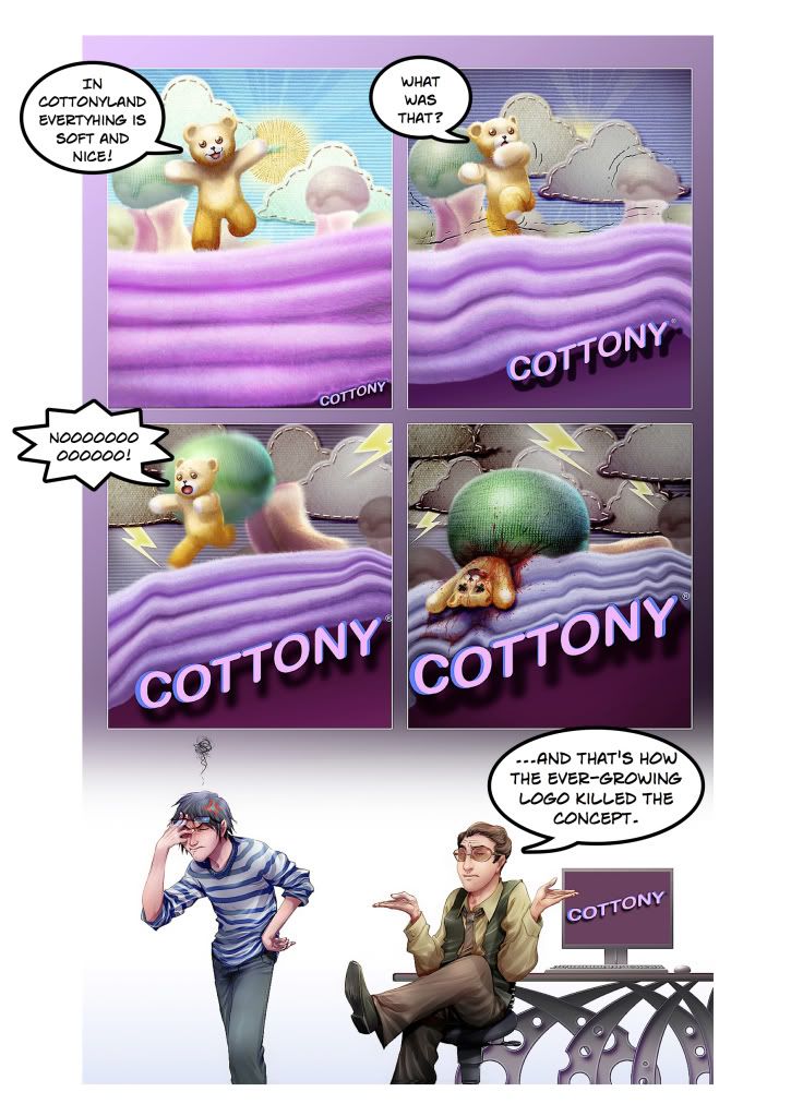
The ever-growing logo. The nightmare of every art director. I've never been able to fully understand the reasoning behind making the logo bigger. Is it supposed to make the product stand out? Make it more desirable? A bigger logo is as ridiculous as it would be shouting the name of the company during a radio spot. It doesn't make sense.
For this strip I worked with the super talented Gleydson Caetano. To learn more about this Brazilian artist please visit his DeviantArt page. http://gureiduson.deviantart.com/
2 comments:
Hahahaha, fucking perfect.
Logo size doesn't always mean much, as you suggest; but then, brand awareness is something I think a lot of companies would like to have more of.
Take Nike's swoosh. Instantly recognizable, quite literally iconic -- and many of their ads are comprised of damn little else apart from their logo.
There's balance, I suppose, to be found in having the logo present, maybe as the final element in a design, a little like the "Burma Shave" at the end of those inane little roadside poems of the last century. Logo as visual punctuation.
But in order for that to work, of course, the ad needs to tell a coherent story, which is often harder than most people realize. For instance the "cottony" bear, while cute, doesn't do anything other than being cute, so on balance there's no reason not to focus on the logo/brand name alone.
(I realize I'm being overly analytical of a cartoon. Can't help it.)
Post a Comment